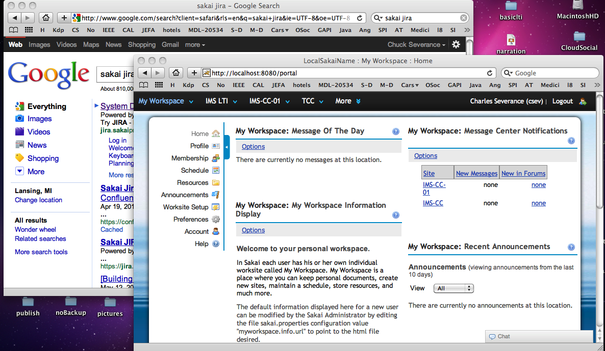
 Google now has a black top bar with sans-serif white and grey text that looks like Sakai 2.9’s Neo Portal! (Click on image to see full size screenshot).
What is next? Rounded corners and a pool of water background for Google?
I would say that Gonzalo’s glowing blue for the selected item and our speedy-drop-down nav and expando-matic still puts Neo well ahead of Google in terms of UI goodness. I would say that it is good for Google to continue to aspire to UI greatness, using Sakai Neo as its roadmap.
(To be fair) Neo took its look and feel cues from Sakai OAE, and Sakai OAE ripped a lot of its look and feel from Twitter, I think – or perhaps Twitter took its latest look and feel from early OAE work. It is so confusing to keep track of who borrowed ideas from whom.
P.S. But seriously, it is nice to see a bit of convergence in these UI’s serving common purposes. It is all good for the users IMHO.