Google Adopts User Interface Design from Sakai 2.9!

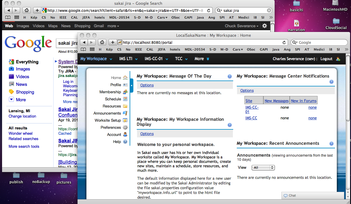
Google now has a black top bar with sans-serif white and grey text that looks like Sakai 2.9’s Neo Portal! (Click on image to see full size screenshot).

What is next? Rounded corners and a pool of water background for Google?

I would say that Gonzalo’s glowing blue for the selected item and our speedy-drop-down nav and expando-matic still puts Neo well ahead of Google in terms of UI goodness. I would say that it is good for Google to continue to aspire to UI greatness, using Sakai Neo as its roadmap.

(To be fair) Neo took its look and feel cues from Sakai OAE, and Sakai OAE ripped a lot of its look and feel from Twitter, I think – or perhaps Twitter took its latest look and feel from early OAE work. It is so confusing to keep track of who borrowed ideas from whom.

P.S. But seriously, it is nice to see a bit of convergence in these UI’s serving common purposes. It is all good for the users IMHO.

5 Comments

  1. I like to think you both adopted the toolbar from http://www.coursesites.com, but I may be biased. ;-) Sakai 2.9 is definitely looking pretty nice!

  2. George – you make a good point :). I am sure the CoueseSites UI was in place long before the design of 2.9 started but I never saw it. By the time CourseSites was announced (Feb 2011), Sakai 2.9’s UI was well under way. Of course it is nice for everyone as these things converge.

  3. Bruce D'Arcus says:

    I think if you spend some time with Google+, the UI enhancements there go more than skin deep, and get to some really elegant ways to facilitate communication and sharing; things that (as I wrote in a couple of posts on sakai-ux) are actually pretty similar to OAE, but still an improvement over it. So, for example, it’s not the shiny black toolbar, but the nice new notification bar that hangs off of it.

  4. Bruce – You are 100% right- I am just having fun. In a way, seriously the fact that all these systems are starting to converge is (a) great for users and (b) due to JQuery’s domination of the marketplace. When web designers can *assume* JQuery, we can build really pretty consistent user interfaces. And what we are really seeing is a transition towards web applications looking increasingly like desktop applications *without* extreme and impractical measures like GWT. HTML5 is being designed with all this in mind and will (in time) be completely awesomely revolutionary.

    It is fun for all of us to see what the other products do and adopt which works well.

  5. Bruce D'Arcus says:

    Good point on JQuery helping to raise the bar. I get the feeling we’re now starting to see even higher-level JS frameworks (say backbone.js) that may ultimately yield further innovation.